FIFA Ultimate Team 19 Console
console games, gaming
2019
team shoutouts
Simon Jenkins, Mimi Lee, FUT 19 Console Dev Team
Challenge
Unlocking Potential.
FUT is a mode within the FIFA console game. It enables users to build teams using soccer players to play offline and online, as well as to win coins to buy better players or packs.
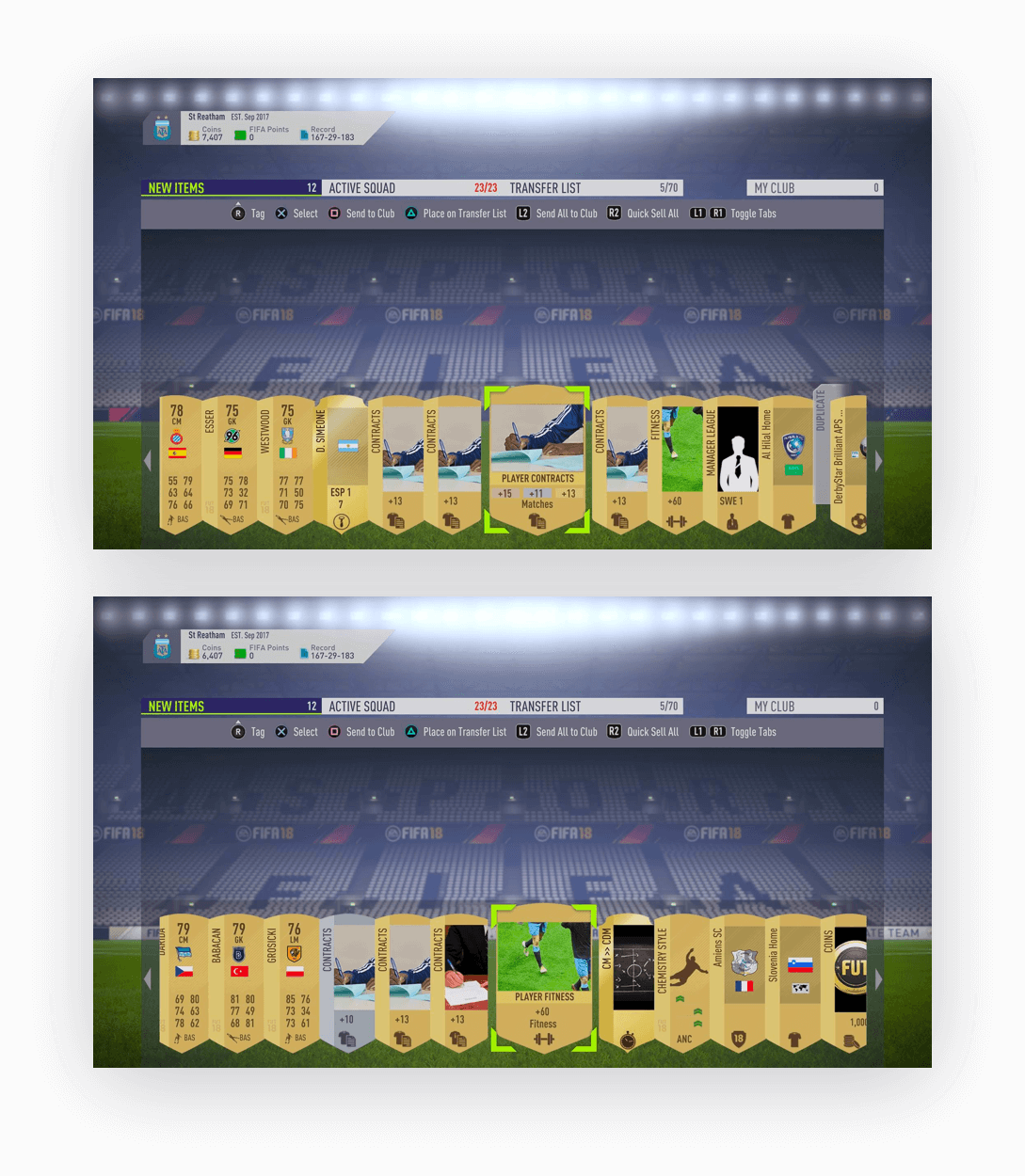
Previously, when users opened a FUT pack, they had to select each individual item and click the controller button to perform an action for every item. However, these controls weren’t immediately visible other than the top strip of buttons.
This presented two problems for users - new users not knowing what actions they can do with their items and excessive clicking that slowed down returning users from sorting their new items. The New Items screen was carrying a lot of potential, but just not executing it the right way.
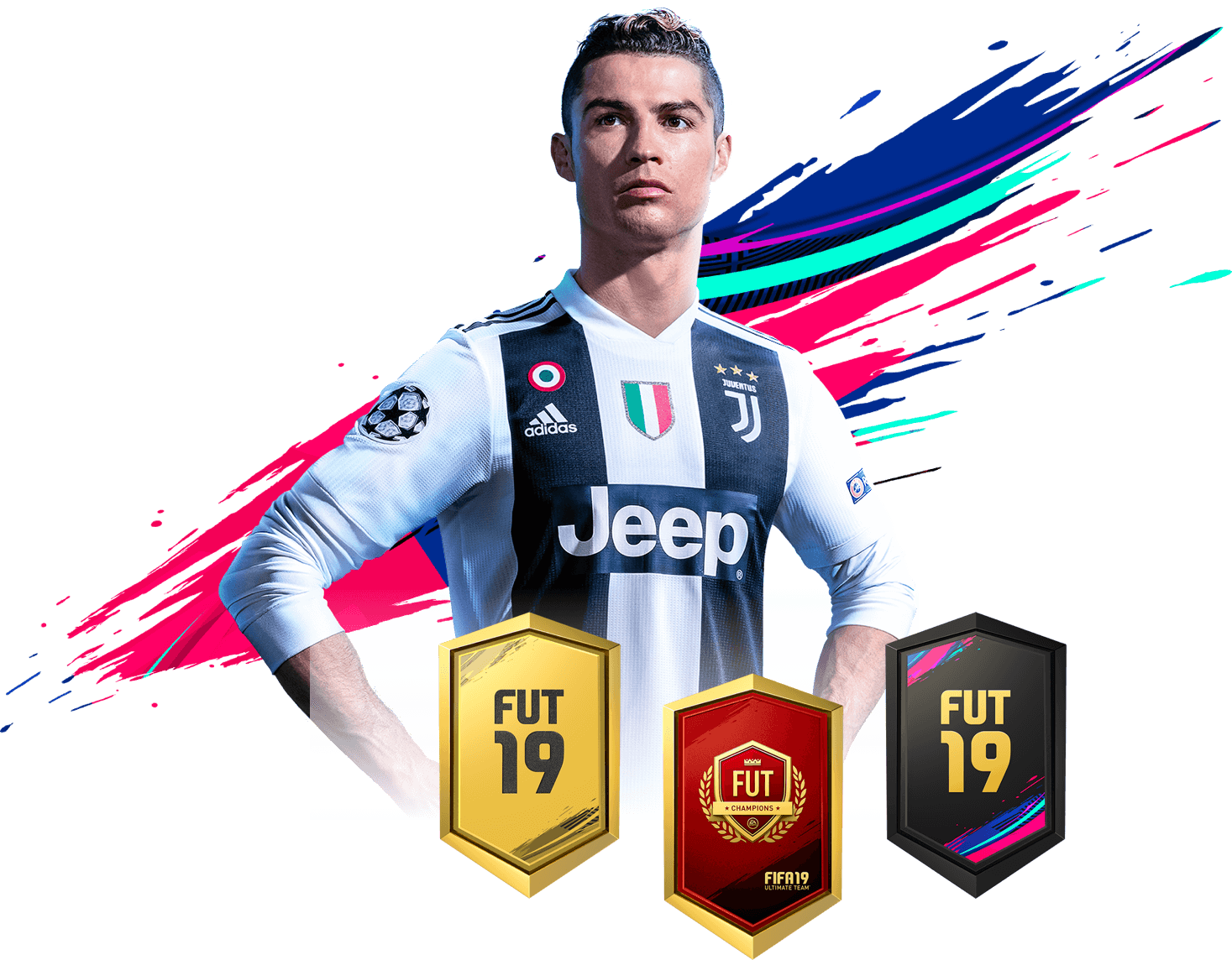
Energy. Motion.
The user journey was key for the design decisions made. Users are left on a high note after opening a pack of items and they don’t want to be disappointed by what comes next. With that in mind, I wanted to take the theme of energy and translate it into the interface by using the bold FIFA 19 brand colours.
new layout.
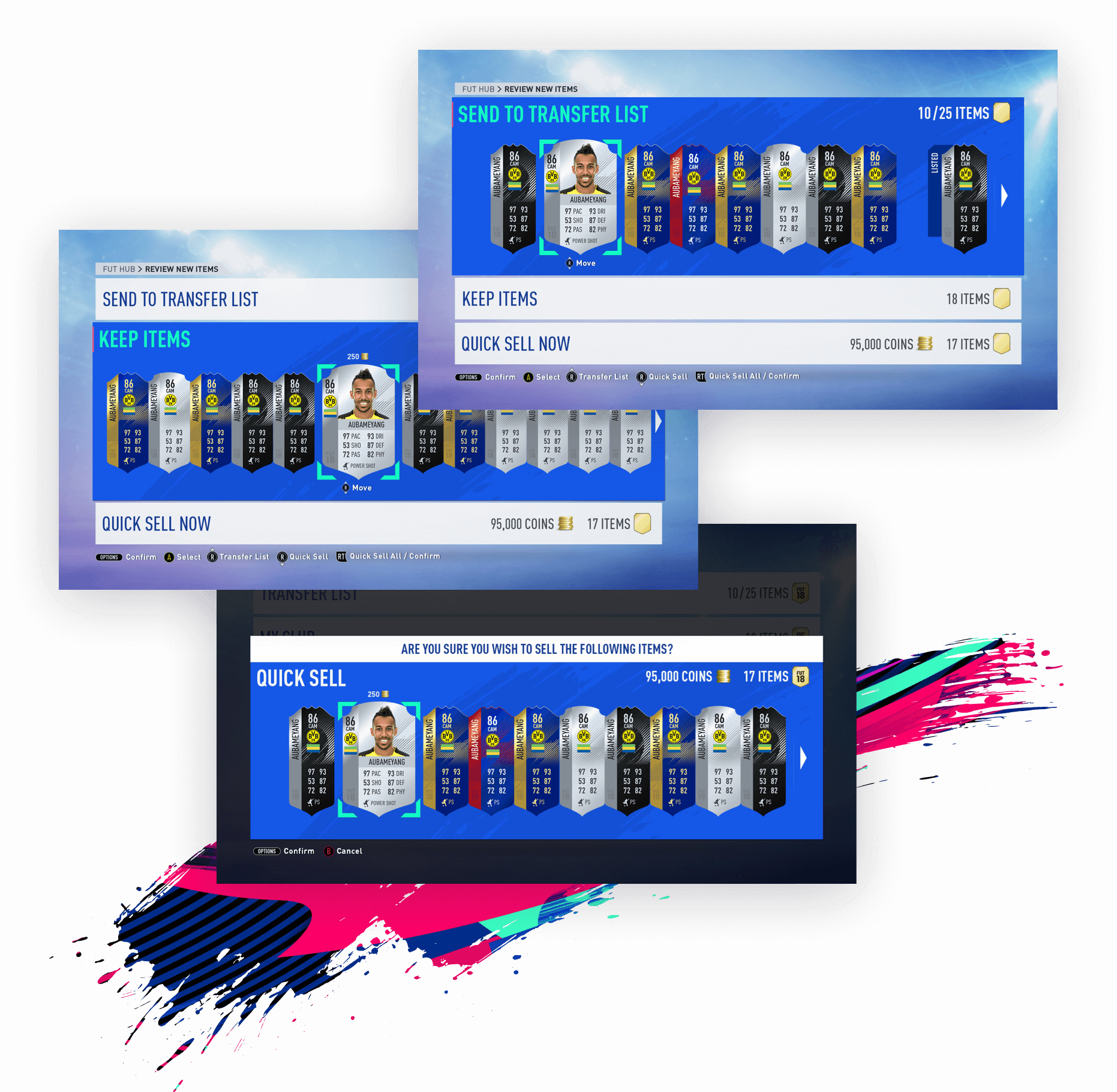
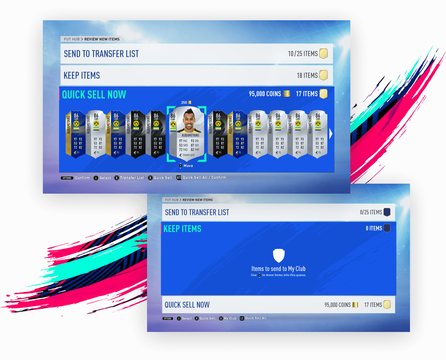
We surfaced the actions in big tiles similar to how the rest of the game is styled. As users already have a mental model of how to interact with big tiles already, there was less room for error on how to interact with it.
In this way, the call to actions are much more clear instead of hiding it behind tabs at the top of the screen. Once the user has sorted the action tile where each item should go into, they can confirm and be on their merry way.
Duplicate Players.
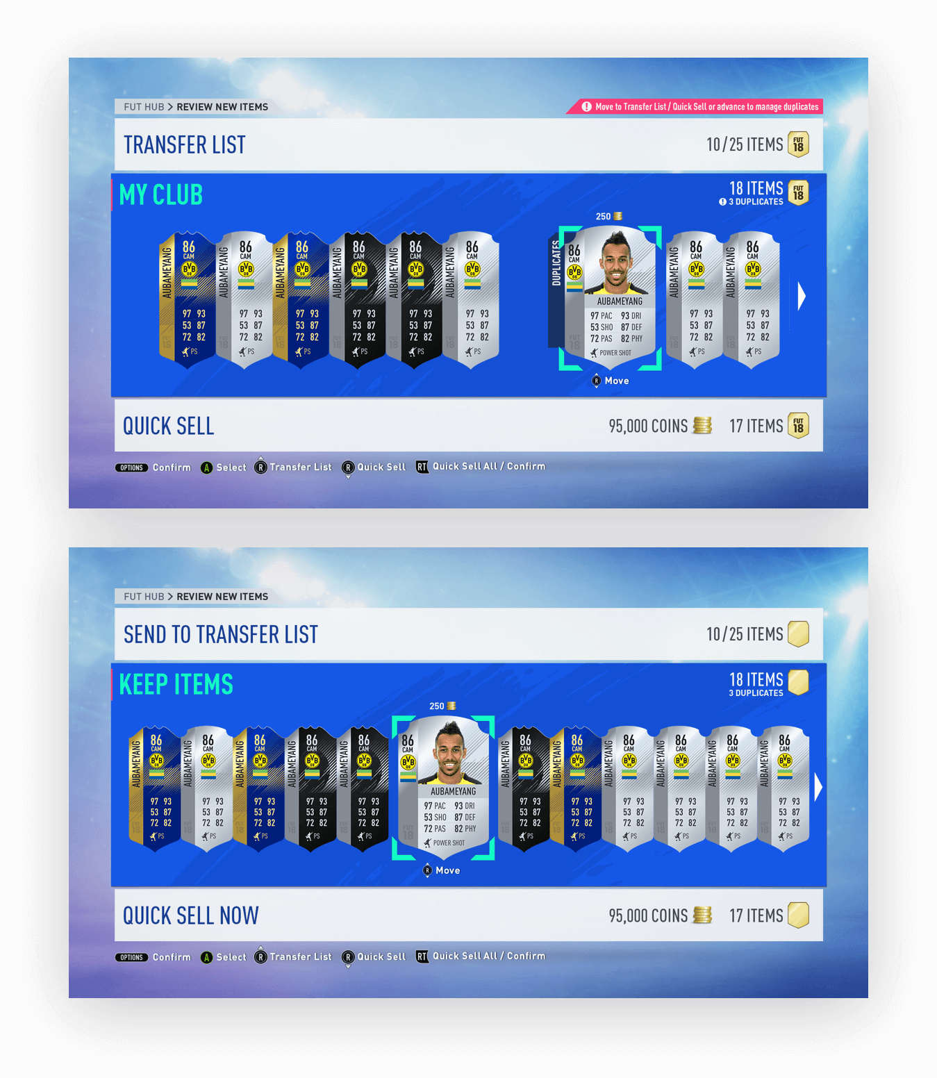
A common use case is when users have to deal with duplicate players. A user cannot keep the same player in their club, so the user will either have to quick sell it for coins or send it to the Transfer List to sell on the market.
I made a couple of iterations trying to surface how to deal with duplicates through iconography and callouts (shown in the first image), however in the end we decided to keep the flow the same and made it more apparent in a small duplicates callout on the tile (shown in the second image).
snappy micro-interactions.
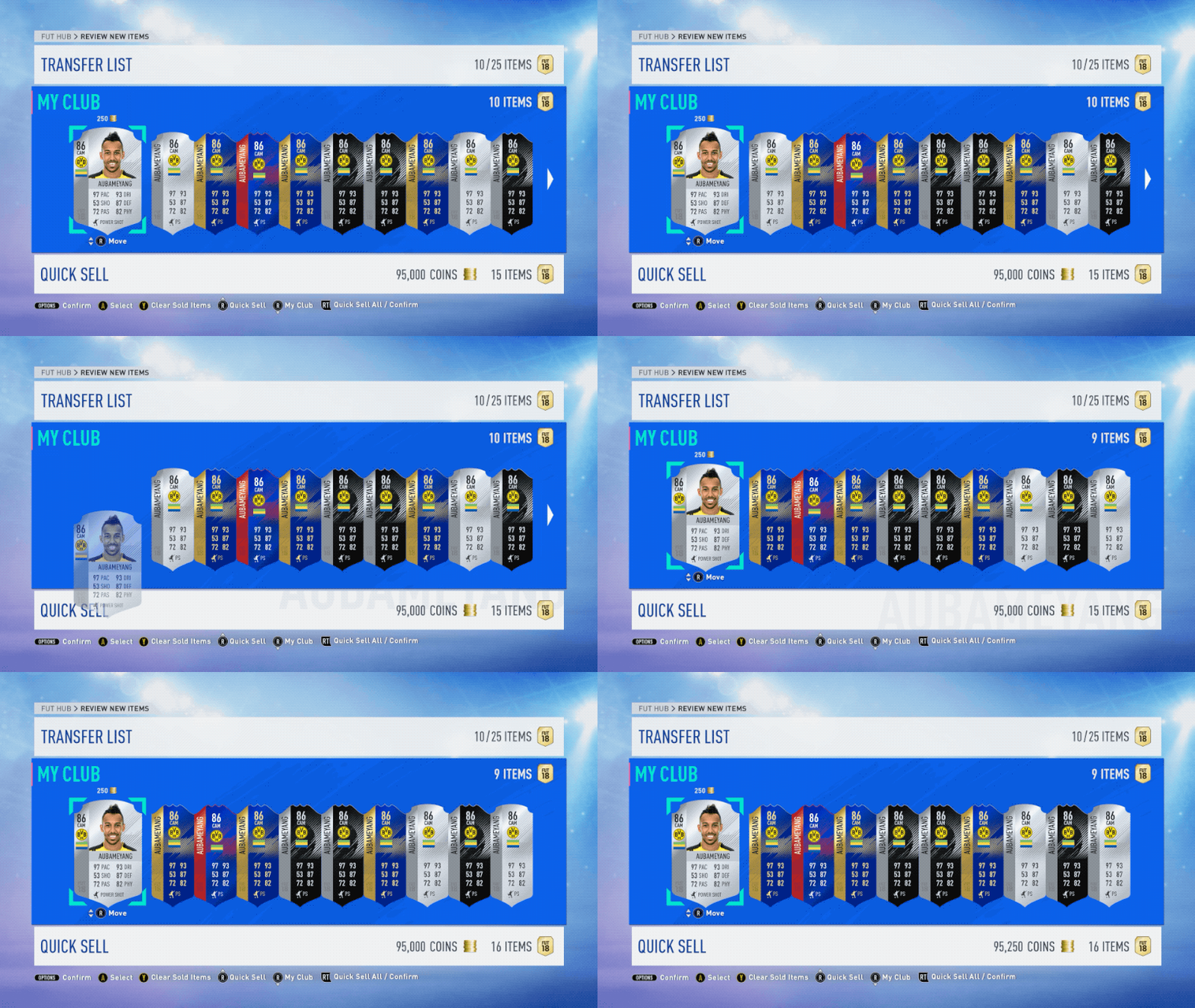
With the theme of motion, I iterated on how to make the experience feel faster. At first, we thought it would give a personalized touch to display the name of the player in the background when added to a tile but because of legal constraints we decided against it (shown in the first image below). Instead, we opted for subtle glows and increased the sizes of the coin and item icons (shown in the second image below).

tech.
Photoshop
All FIFA files were designed in Photoshop with shared libraries for FIFA assets.
After Effects
I used After Effects to create all animations to replicate what the experience would look like.
Context is key.
I learned that context really is essential to creating a great user experience, especially since there are so many edge and use cases that a user might go through.
It’s important to always think back in the mind of the user and catch those edge cases so the design works for every scenario. In this case, I relied heavily on the UX designer’s game knowledge of how a user interacts with the New Item screen.
