Developer Center
B2B, technical documentation
2019
responsibilities
Product design, Visual design, UX research
Challenge
Need for scalability.
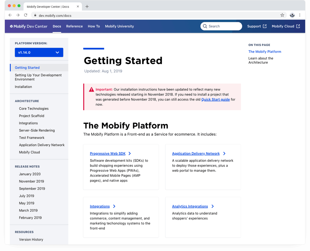
Like many SaaS companies, technical documentation was most often an afterthought and was usually given less importance compared to product feature work. The Mobify Docs site was built years ago, however the scale of documentation grew bigger than the site could handle making it harder for users to find the relevant information they needed to know about our platform quickly.
I came to this project after card sorting had already been done for improving the site’s information architecture. Using those results, Jennifer (another awesome designer) and the team had put together some initial mocks.
improving find-ability.
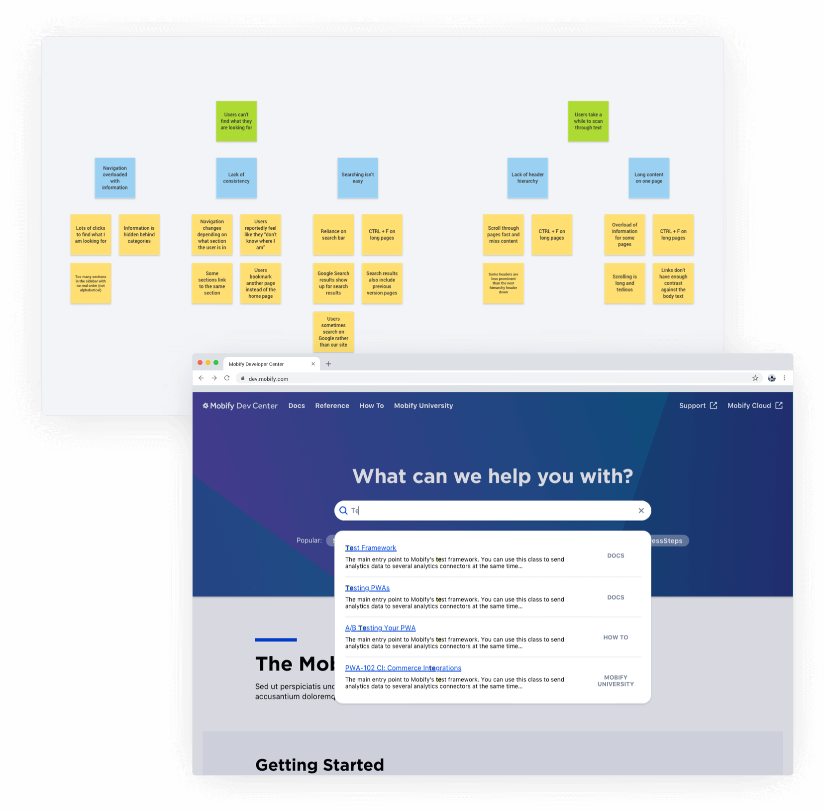
After chatting with internal developers and our partner success team, I affinity mapped all of the user issues. Grouping all the user needs helped us to see two big user goals we could improve upon: find-ability and readability of docs.
The existing docs site had a heavy reliance on the search bar in our Google Analytics tracking and users had commented before how they couldn’t find what they are looking for since the sidebar nav changed depending on which section they were in. We focused our efforts on improving both of these user goals for the initial release with an emphasis on guiding new users.
reinforce consistency.
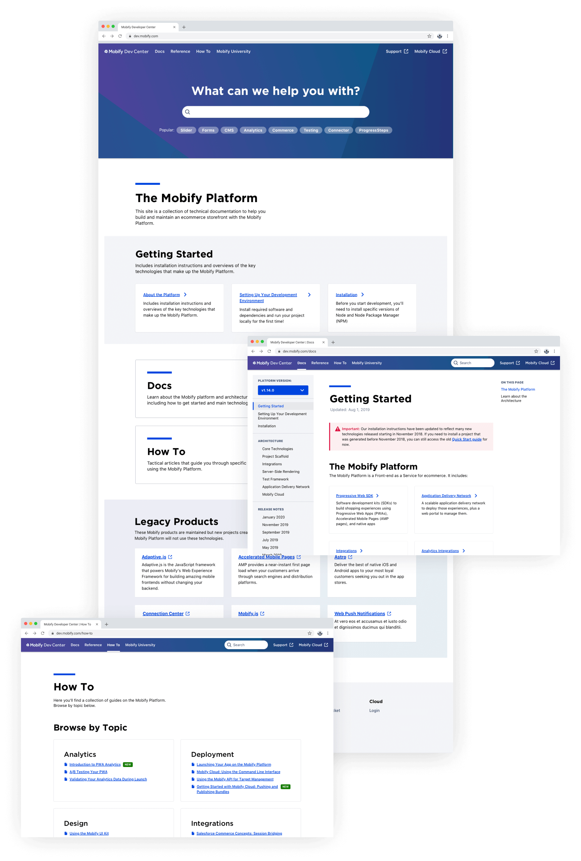
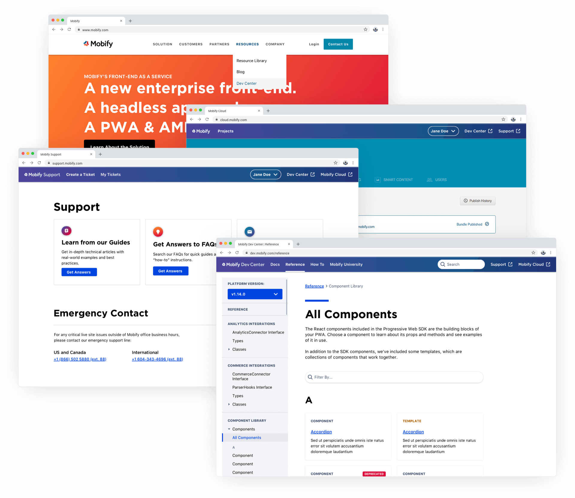
Since Mobify has other micro-sites like Support (for support tickets) and Mobify Cloud (logging into their account project dashboard), it was important to unify this experience to make it feel cohesive. Although the dream was to consolidate all of the sites into one, it would require a ton of dev work - another project for another day.
Instead, the team agreed on building the structure for the future vision and making the transition feel as seamless as possible with the header. We surfaced all other micro-sites at the top and made it consistent across every page on the site.
chunking information.
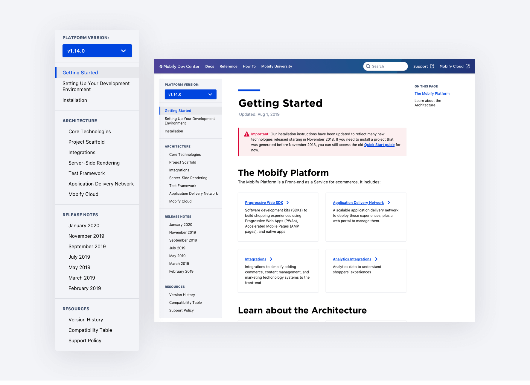
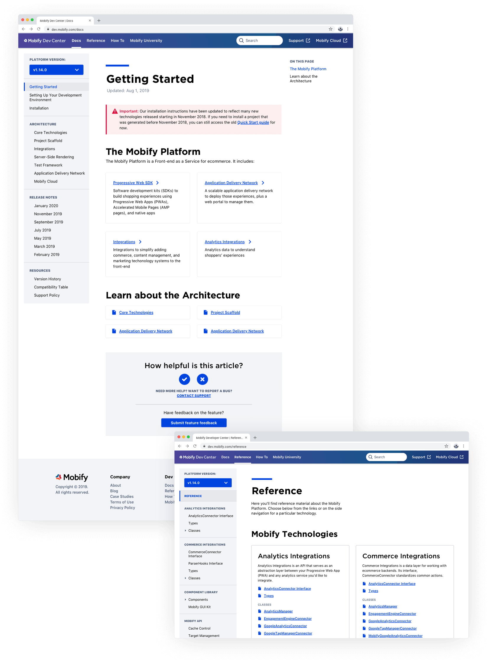
To increase find-ability for new and returning users, we used the new information architecture from the card sorting test to categorize the sub-navigation.
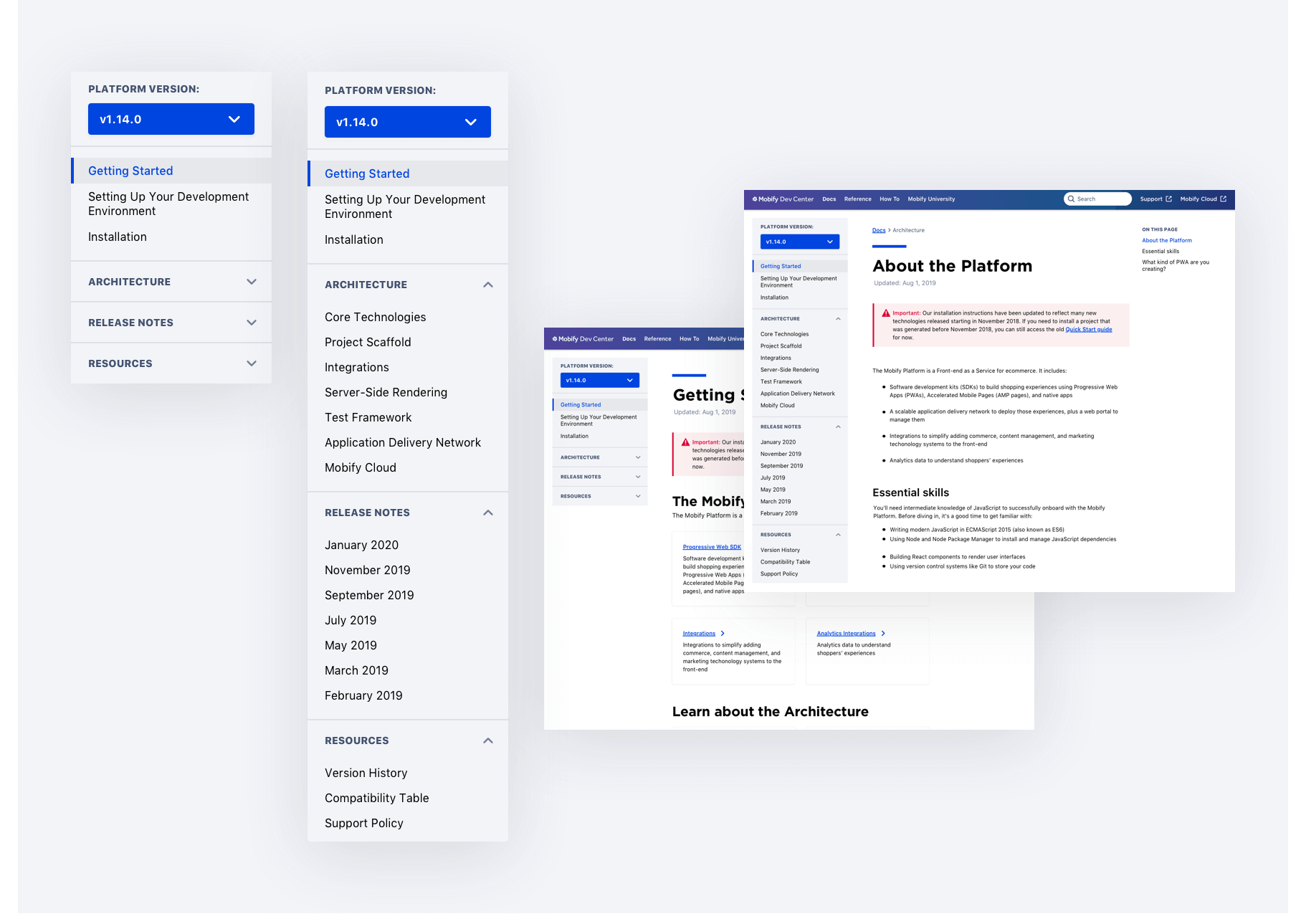
Originally, we used the same accordions from the original site but quickly found it wasn’t working for the new IA with less content. After many iterations and running through it like an end user would, we ended up exposing more of the pages to avoid excess clicking.
surfacing content for new users.
We also focused on guiding new users to the right content to have more visibility on the entirety of our platform without overwhelming them with new info. I worked closely with Richard (our technical trainer) to chunk the information correctly and to link to the most relevant pages a new developer may be looking for.
tech.
Sketch
I mostly worked in Sketch to create all of the mockups and helped build a design system with the other designer to make it easier for future maintenance.
Invision
Invision was used to create clickable prototypes and show the value to stakeholders.
Gatsby
The actual site will be run on Gatsby, which proved to have some feasibility constraints but were worked around.
the need for prioritizing.
A huge takeaway from this project was the need to prioritize earlier what was essential for the first release of the new docs site and what could be implemented later in a second release or small hot fix.
With a huge time constraint to get a site redesign finished in a few months and limited resources, there were battles we had to pick and choose to focus our efforts on making the user experience up to par with other standard developer documentation sites like React.
The outcome resulted in lower support tickets for our support team and fewer training calls by creating a more self-serve docs site. The new site also had quicker time to task for core flows.
FUT 19 Console.